Identity · Design · Land
Three labels,one story
The label on a Vie del Lago jar is not decoration. The medallion, the engraved landscape, the colour of the honey: every design choice comes from a production choice.
The graphic design
An identity bornfrom the land
The label must be as honest as the honey inside. No fanciful illustrations: everything you see represents something real – the lake, the clays, the method.
Three different honeys, three different colours, one family. The medallion at the top, the engraved landscape at the bottom and the classic typography stay the same and hold the differences together.
The language is that of fine publishing, restrained and with plenty of white space: opening a jar should feel like opening a well-made book.
Reading the label
Every elementhas a meaning
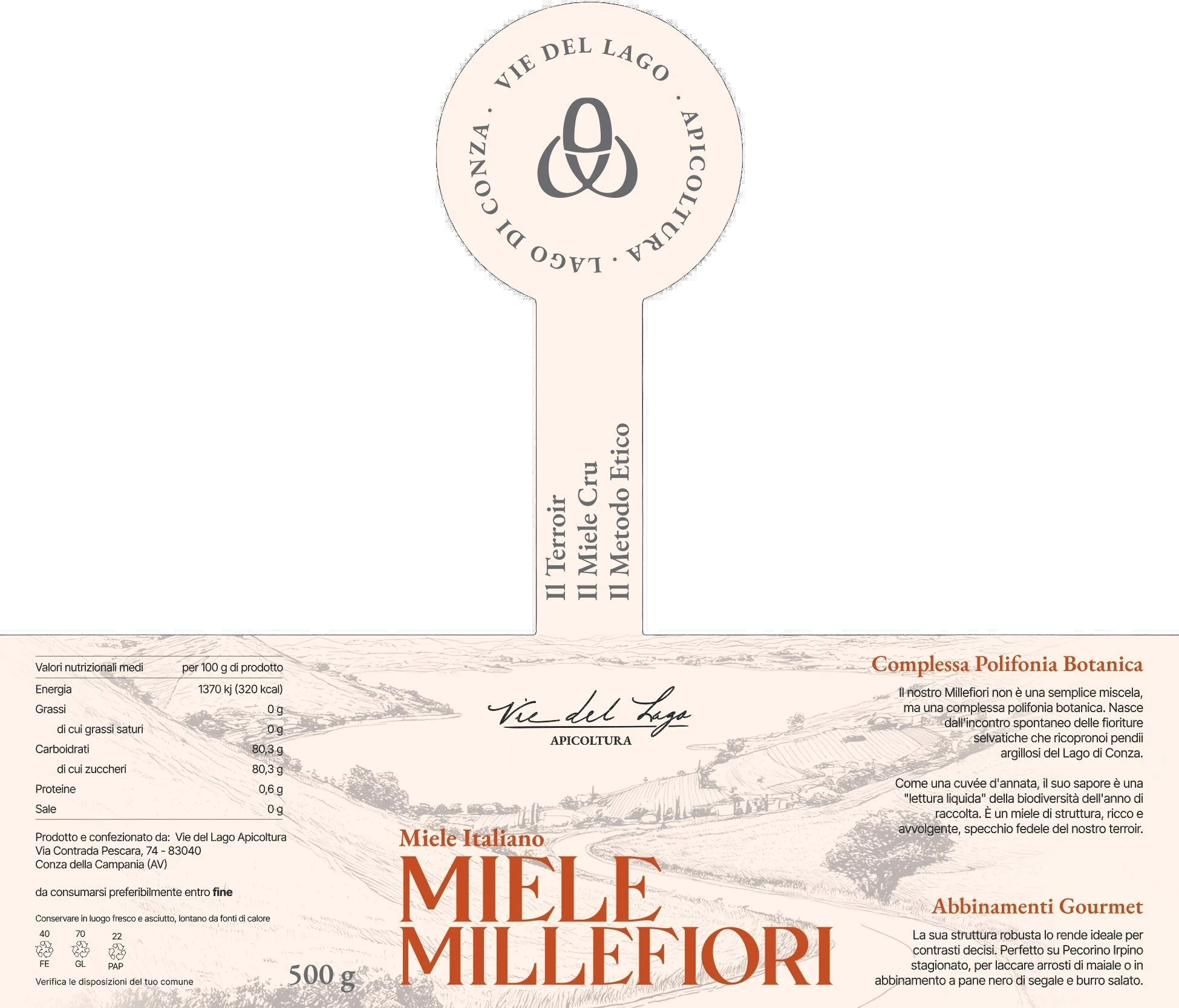
-
The medallion
In the centre, a stylised bee containing the “V” of Vie and the “L” of Lago. Around it, the circular text “Vie del Lago · Apicoltura · Lago di Conza”: a seal of origin.
-
The stem and the three values
Below the medallion, running vertically: “Il Terroir · Il Miele Cru · Il Metodo Etico” (the terroir, the cru honey, the ethical method). They read from bottom to top, like a growing plant.
-
The landscape and the signature
A fine-line illustration of the Ofanto Valley and the lake. Below it, the signature “Vie del Lago Apicoltura”: the only handwritten part.
-
The name and the colour
The honey's name fills the lower part, in a wide serif. Its colour is the product code: terracotta, green, antique pink.
-
The texts on the right
A heading describing the honey and food pairings: real tasting notes, not slogans.
01 / 03
Millefiori honey
Complex botanicalpolyphony
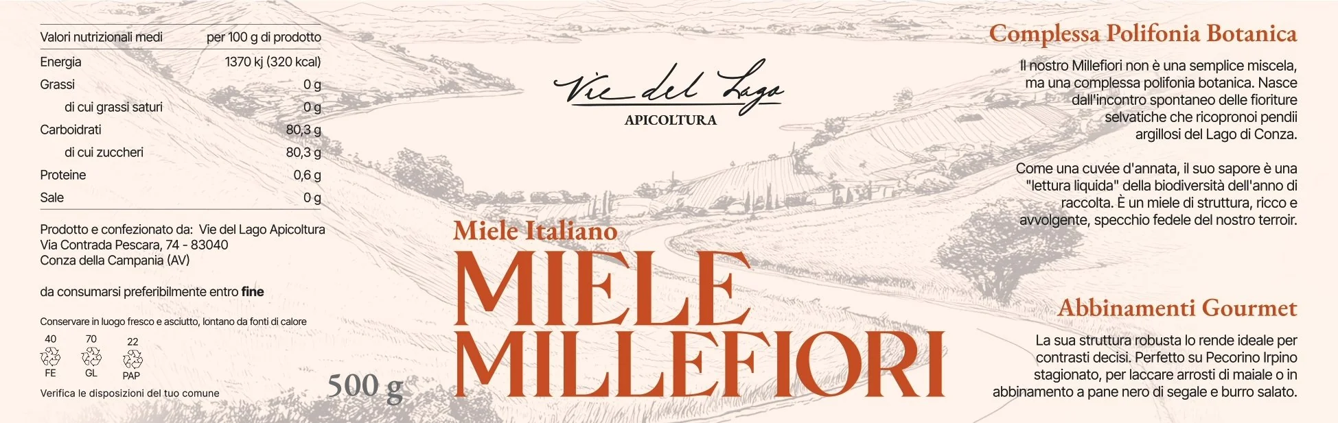
Millefiori is the hardest honey to describe, which is why it needed the most ambitious label. It is not just any blend of flowers: it is a botanical snapshot of a year in the Conza Oasis. The label calls it “a liquid reading of the biodiversity of the harvest year”.
Terracotta recalls the Irpinian clays, the summer heat and the robust structure of the honey, the densest of the three. It speaks of the soil even before the flower.
- Terracotta. The clays of the Ofanto Valley, the honey's structure, the Irpinian summer.
- The heading. “Complex botanical polyphony”: many blooms together, like the voices of a choir.
- The pairings. Aged Irpinian pecorino, roast pork, dark bread and salted butter: flavours of the same intensity.
02 / 03
Acacia honey
Crystal-clearmonofloral elegance
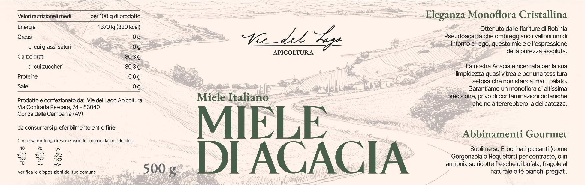
Acacia is the honey of precision: a lab-verified monofloral, perfectly clear, almost glassy. The label translates this purity into the most restrained green of the family.
Green isn't the obvious choice, since black locust has white flowers. It is the colour of its surroundings: the cool shade of the valleys, the dense vegetation, the water of the lake. It speaks of freshness and delicacy, like the honey's silky texture.
- Forest green. The lake's damp valleys, the shade of the locust trees, the freshness of the monofloral.
- The heading. “Crystal-clear monofloral elegance”: acacia stays runny for a long time; its clarity is a real quality.
- The pairings. Blue cheeses such as gorgonzola or roquefort, buffalo ricotta, strawberries, white teas.
03 / 03
Sulla honey
The mineralityof clay
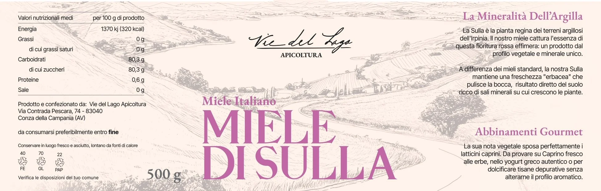
Sulla is the rarest of the three: a red bloom lasting a few weeks on the clay soils of Irpinia, which hardly any other beekeeper works. The label celebrates it with an antique, almost dusty pink, close to the colour of its flowers.
The heading describes what sets this honey apart: a herbaceous freshness the others don't have, linked to the mineral salts of the clay soil where sulla grows.
- Antique pink. The colour of sulla flowers, which tint the Irpinian hills for a few weeks in spring.
- The heading. “The minerality of clay”: a clean freshness that, as the label says, cleanses the palate.
- The pairings. Fresh herbed goat's cheese, Greek yoghurt, herbal teas: fresh, tangy flavours that the honey brings out.
The visual system
What unitesthe three labels
The medallion
The bee with the “V” and the “L”: nature and identity in a single mark, recognisable at a glance.
The fine-line landscape
Always the same scene, the Ofanto Valley with the lake: it is the map of the land where the bees forage.
The typography
Classic serif for headings, script for the signature, spaced capitals for the name: the Italian publishing tradition.
The beige background
The same warm beige as the brand: natural paper, wax, packaging. Not industrial white.
The nutrition table
It isn't hidden: it fills the left-hand column, in a readable typeface. Anyone who wants to know finds everything straight away.
The three values
“Il Terroir · Il Miele Cru · Il Metodo Etico” never change: they are a promise, not a description.